Inattendu is a Swiss blog with the newest in fashion, design and interior. Never sleeping. Inattendu ist einer der grössten Schweizer Blogs mit dem Neusten aus den Bereichen Mode, Interior und Lifestyle.
I’m always excited when Norwegian paint companyJotun releases their new colour chart for the coming year. The new colour chart is called Rediscover and presents a range of 4 new colour palettes in combination with selected shades from Jotun’s rich colour archive.
Jotun’s global color manager Lisbeth Larsen and her international team have once again looked ahead and developed a new global colour chart with beautiful colours and palettes that reflect the spirit of the times.
1. Warm atmosphere with rustic colours
The first theme of the color chart has been inspired by the world, from golden-pink tones of Moroccan desert sand to burnt orange tones with Mexican references. The colors of the earth create associations with landscapes and cultures around the world.
Clay and stone, sand and earth, the materials that form both houses and cities are essential. Red and brown, muted yellow and rustic terracotta. These are earth tones that have a unifying effect.
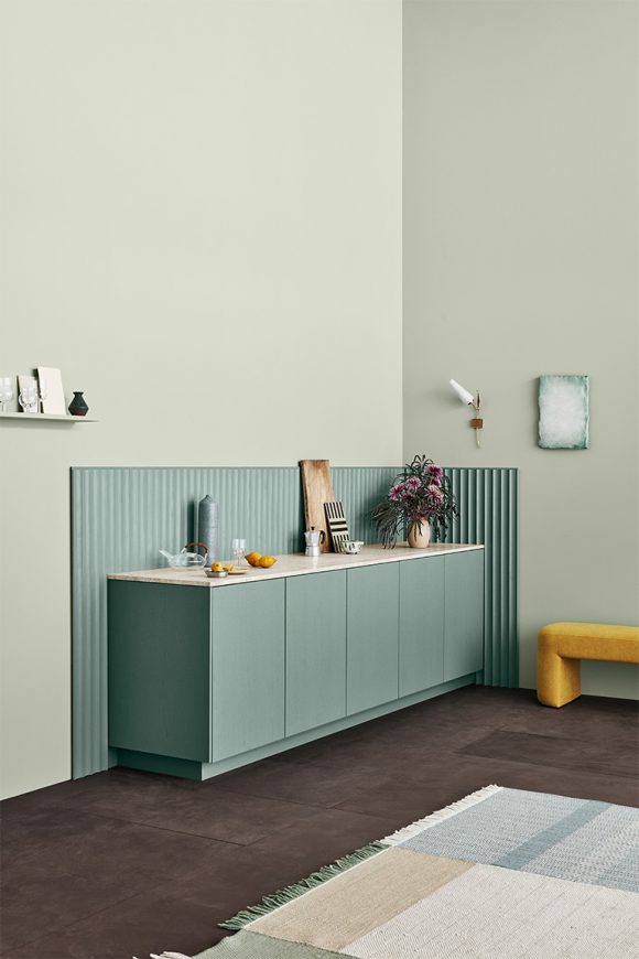
2. Soft, neutral colours in sensual harmony
The second theme highlights the most beautiful, neutral hues in beautiful combinations. In a world marked by change, the need for clarity and calm arises. We facilitate this by simplifying our homes, and many are looking for a neutral and harmonious color base. We clean, remove the superfluous and appreciate the simple.
The combination of neutral colors can have a great influence on the atmosphere in a room. These colors do not demand attention, but envelop us with their clarity and soft, calming appearance
3. Airy Blue Tones and Timeless Contrasts
The classic Nordic color palette with subdued blue tones is forever relevant! Here colours are put together in a wonderful new combination.
The sight of sky and sea seems uplifting; thoughts turn to the unknown and infinite, and we sense the tranquility that rests in a pristine coastal landscape or in a distant horizon.
This is a palette for those of us who want to be more present in the now, and seize the moment. With these colours you can create a cozy and harmonious look. They encourage you to make your home an inviting haven where you can recharge your batteries.
4. Muted and Dreamy Pastel Colours
The fourth theme is my favourite and consists of muted pastel shades, beautifully composed in a brilliant symphony of colours.
This is a palette for the esthetician, who values design traditions and art history. The shades are as created for the curated home, where carefully selected art objects and decorative objects testify to an interest in interiors and details.
I’m always excited when Norwegian paint company Jotun releases their new colour chart for the coming year. The new colour chart is called Rediscover and presents a range of 4 new colour palettes in combination with selected shades from Jotun’s rich colour archive.
Jotun’s global color manager Lisbeth Larsen and her international team have once again looked ahead and developed a new global colour chart with beautiful colours and palettes that reflect the spirit of the times.
1. Warm atmosphere with rustic colours
The first theme of the color chart has been inspired by the world, from golden-pink tones of Moroccan desert sand to burnt orange tones with Mexican references. The colors of the earth create associations with landscapes and cultures around the world.
Clay and stone, sand and earth, the materials that form both houses and cities are essential. Red and brown, muted yellow and rustic terracotta. These are earth tones that have a unifying effect.
2. Soft, neutral colours in sensual harmony
The second theme highlights the most beautiful, neutral hues in beautiful combinations. In a world marked by change, the need for clarity and calm arises. We facilitate this by simplifying our homes, and many are looking for a neutral and harmonious color base. We clean, remove the superfluous and appreciate the simple.
The combination of neutral colors can have a great influence on the atmosphere in a room. These colors do not demand attention, but envelop us with their clarity and soft, calming appearance
3. Airy Blue Tones and Timeless Contrasts
The classic Nordic color palette with subdued blue tones is forever relevant! Here colours are put together in a wonderful new combination.
The sight of sky and sea seems uplifting; thoughts turn to the unknown and infinite, and we sense the tranquility that rests in a pristine coastal landscape or in a distant horizon.
This is a palette for those of us who want to be more present in the now, and seize the moment. With these colours you can create a cozy and harmonious look. They encourage you to make your home an inviting haven where you can recharge your batteries.
4. Muted and Dreamy Pastel Colours
The fourth theme is my favourite and consists of muted pastel shades, beautifully composed in a brilliant symphony of colours.
This is a palette for the esthetician, who values design traditions and art history. The shades are as created for the curated home, where carefully selected art objects and decorative objects testify to an interest in interiors and details.